StringTheory is Live 🚀
The public beta is officially live and free today. Why tracking campaign financing is the next foundation, and how an Agentic SportsCenter is gonna change political storytelling.

StringTheory is officially up and free for the public!
You can sign up instantly with a one-click Google sign-in or set up a traditional account with an email and password.
⚠️ Disclaimer: This is strictly a desktop web experience right now. The high-density chamber maps and timelines need screen real estate, so open this on a laptop or monitor—the mobile layouts and native apps aren’t built yet, but are on the roadmap. Historical congresses are also actively being backfilled as we solidify the graph schema and data ingestion pipelines.
Sign up and start exploring right now:
👉🏽 StringTheory
What’s on the board today
This initial release is focused entirely on the legislative engine — mapping the actual actions of our representatives and the executive branch. It also allows you to follow along as new Bills get sponsored and new Votes occur. Here’s what you can do on the platform starting right now.
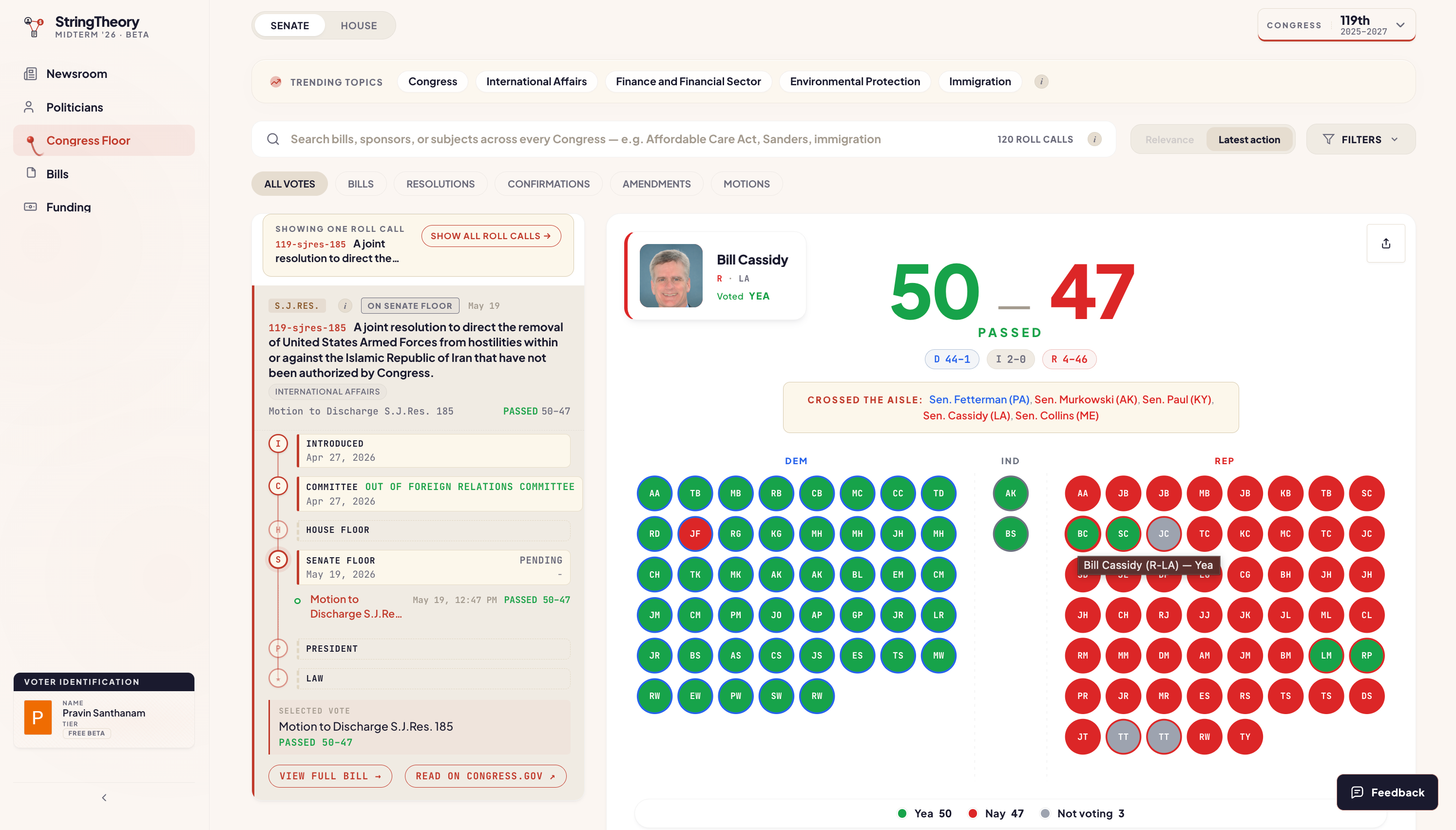
The Congress Floor
A fully interactive visual map of the House and Senate chambers. Search any bill or nomination, select a vote, and watch the seats recolor based on who defected, who skipped, or who held the caucus line.
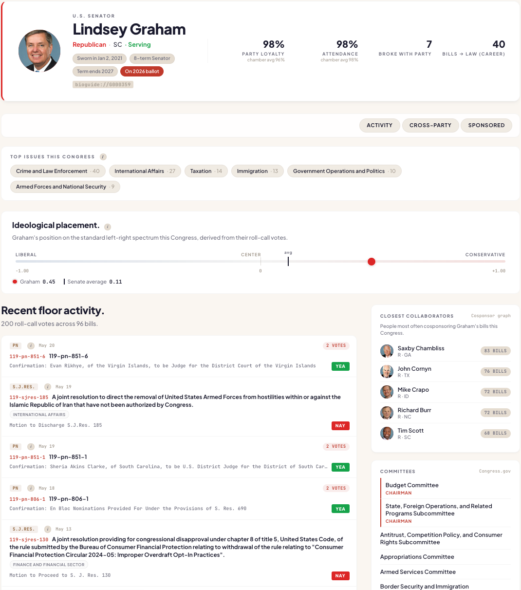
Politicians
Comprehensive profiles of every sitting member and their predecessors back to 1973. Committee assignments, terms of office, an objective ideological placement, and an aisle-crossing engine that isolates every roll call where a politician broke ranks with their party majority.
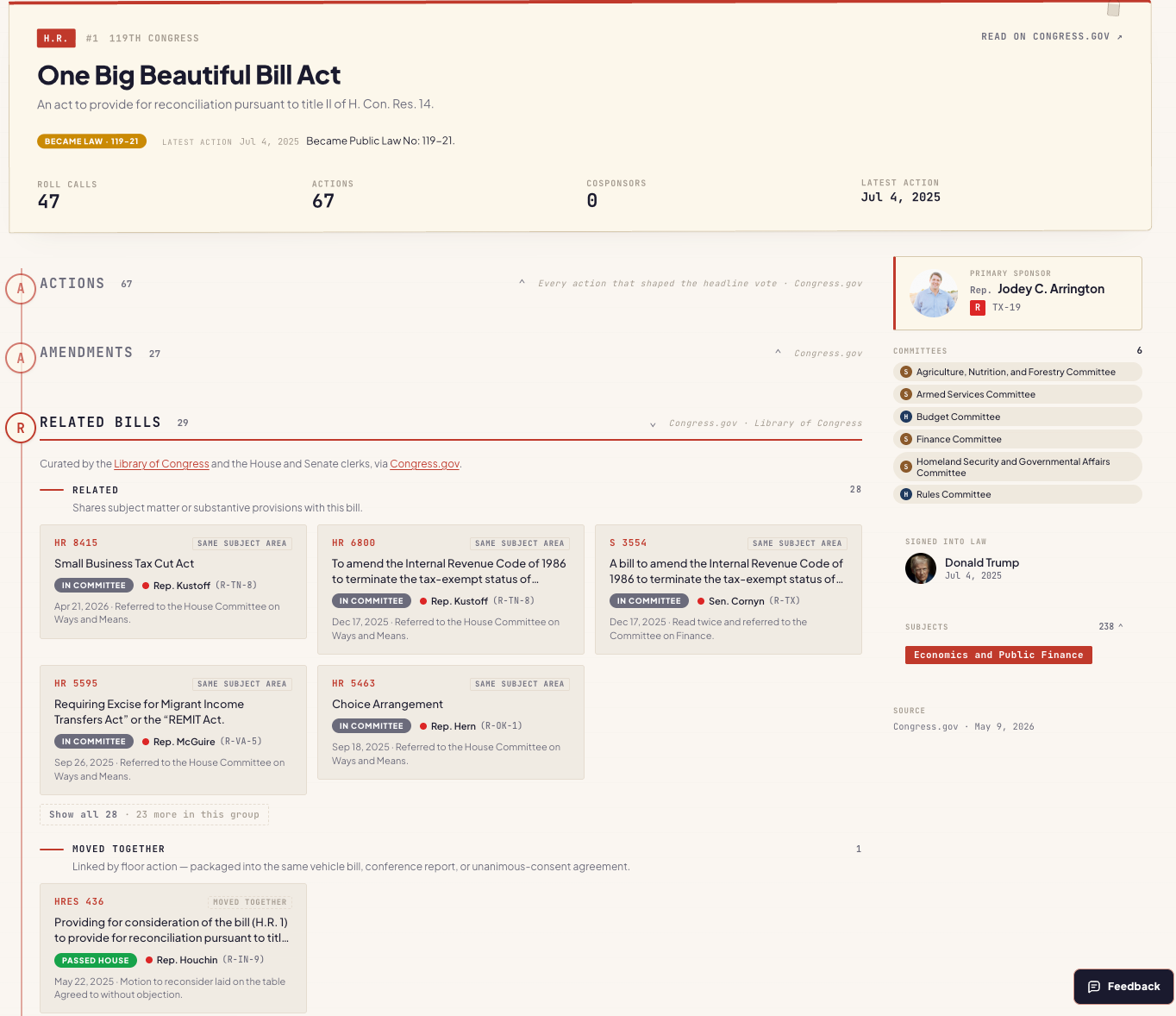
Bills
Centralized hubs for tracking 119th Congress legislation, featuring full enrolled bill texts and a unified status timeline that interleaves physical chamber actions with logical roll-call votes.
This baseline is just the starting line. Now that the core foundation is stable, I want to take you behind the scenes of the next two core features coming next month: fusing Funding, and building the Agentic Newsroom.
Funding
The first major roadmap milestone is integrating campaign finance into the existing Knowledge Graph. The flow of legislation is only part of the story. In order to run campaigns, get elected and gather resources to execute agendas, you need funding. Corporate interests and influential individuals leverage their wealth to influence voting patterns to enable their interests.
Right now, the data-quality pipeline is in the lab, processing millions of FEC data spanning 46 years of election cycles to present. This includes PAC, party, and super-PAC contributions, alongside independent expenditures.
By mapping this data directly into the property graph, we represent financial contributions in the context of the actions they influenced.
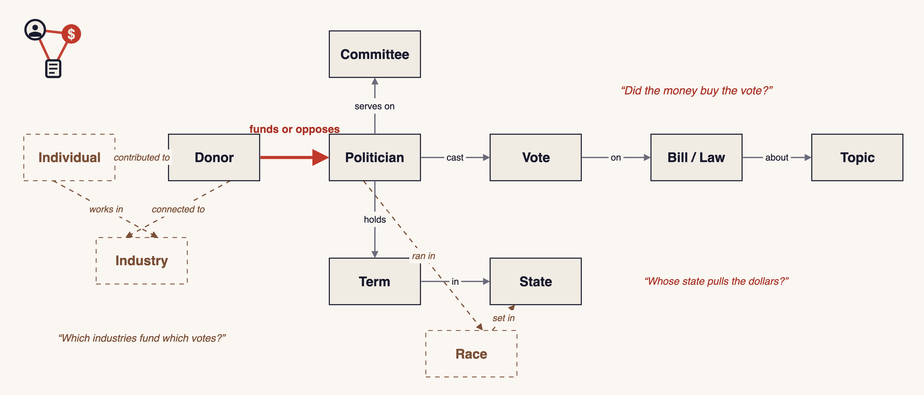
By mapping this data into a network, we move past static spreadsheets to answer three core macro questions
Network Topology (House vs. Senate Profiles)
Because a Senator operates on a statewide or national stage while a Representative defends a hyper-localized district, their underlying funding skeletons are fundamentally different. The graph exposes this contrast instantly:
The Statewide/National Network: Maps distributed clusters of national elite donors, venture capital pools, and out-of-state holding companies.
The Regional Network: Tracks highly concentrated local capital—regional manufacturing syndicates, in-state agricultural operators, and localized power brokers.
The Industry-to-Vote Pipeline
Instead of looking at isolated donations, the schema links an individual contributor to an Industry, which bridges directly to a Politician, a Vote, and a specific legislative Topic. This allows us to map systematic sector patterns across whole caucuses, answering the raw operational question: Which industries fund which floor votes?
Committee and Seat Tracking
Lawmakers do not vote in a vacuum; their power is concentrated inside specific committees. By linking the Committee a Politician serves on to the Donor funding their active Race, the architecture maps whether the money flow correlates directly with upcoming regulatory oversight, committee assignments, or changes to bill text before a vote even takes place.
The Newsroom
The second roadmap milestone is more ambitious, but signifies where this product needs to go and the type of functionality that changes how people consume political content.
Search Bar Paralysis
When I showed this beta to a few early testers, the initial feedback exposed a massive structural blind spot. If you are an active investigator who arrives with a specific bill or representative in mind, the platform can directly address immediate specific questions. In its current state, it does very little insight generation, it focuses on exposing the breadth of data in a structured way to help you explore major entities in full detail. But for casual observers who don’t know what they are looking for, raw data exposure becomes intimidating and can cause paralysis.
They don’t have a specific name to type into a search bar. They don’t know which votes matter, which bills are sliding through committee, or where the friction points hide. They arrive with no clear question, meaning they leave with no clear answers.
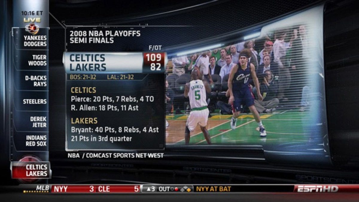
Agentic SportsCenter
The Newsroom takes trending online narratives and roots them straight to an empirical data layer of real actions. By continuously scanning the web to track what the political ecosystem is actively talking about, the Multi-Agent engine isolates a hot topic—whether it’s a high-stakes vote on Iran war powers or a sprawling corporate tax cut bill—and learns to reason about that public discourse. Instead of adopting the partisan spin, it leverages the StringTheory knowledge layer to surface the hidden connections and signals that intuitively explain what is happening under the hood. The final output isn’t editorial commentary; it’s an interactive, data-driven story packed with verifiable insights, delivered as a low-friction alternative to consuming the conventional news, podcasts or short video content.
The inspiration is OG SportsCenter from 2009-2014, before the takes got hot. Scrolling side panel of stories on the left, a single hero in the middle covering the current story, a live ticker across the bottom keeping you up to date
Case Study: Why did Bill Cassidy change his mind?
I built one exhibit to define the standard. This story unfolded just this past week, and it is live on a preview of the Newsroom on StringTheory right now for you to follow along. This interactive investigative post directly leverages our knowledge graph and was built entirely with Claude Code. This was human-in-the-loop coding, not an autonomous agentic run—it pins down the quality bar the system has to hit on its own, rather than a sample of what it already generates out of the box.
To view the full interactive video playback and trace the live data primitives yourself, you just need to create your free account:
👉🏽 Sign up to interact with this story
This story investigates the 50–47 Senate procedural vote on S.J. Res. 185 (Iran War Powers) where Cassidy voted YAY along with Senate Democrats to remove US Armed Forces in Iran.
The entire exhibit fits in a single viewport with no scrolling allowed to enforce effortless consumption. Alongside the content, the “How it got made” trace exposes the full trail of how the Agents used tools and reasoned about the online narratives and StringTheory data.
The Cassidy exhibit uses four distinct primitives:
A Three-Paragraph Lede: Covers the vote, the political frame, and what’s next. It names every defector and ties the flip back to three days earlier, when Cassidy lost his Louisiana primary to a President Trump-endorsed opponent. It also flags the three absent Republicans whose return would have killed the resolution by tipping the tally to a 50–50 tie. Links to all mentioned Politicians.
A Nine-Tick Timeline: Maps Cassidy’s full Iran war-powers voting record this Congress. It exposes that he voted along party lines 8 straight times before suddenly flipping sides on May 19. Every tick is an interactive data visualization linking directly to that specific roll call on the Congress Floor.
A Two-Column Reading Panel: Contrasts the official narrative against the graph. Column one features the Cassidy Statement—his NBC-sourced quote citing constituent concerns and Pentagon ambiguity. Column two displays What Else Was True—three grounded facts that complete the picture: he lost his primary on May 16, Trump endorsed his opponent back in January, and his term ends if he does not win the Midterms this fall.
A Loyalty Footnote: Contextualizes the baseline. It tracks Cassidy’s 97.5% party loyalty against the three routine GOP crossers—Collins (73.1%), Paul (74.2%), and Murkowski (78.8%). The graph proves the other three were always statistically likely to cross the aisle. Cassidy was not.
How the system works
Producing a piece like this autonomously breaks into three jobs. The Cassidy walk-through is the easiest way to see what each one has to do.
1. Information Agent — Find the story.
These agents continuously scout the noisy open web, breaking news feeds, and social channels to map what the political ecosystem is actively discussing. They flag current events that are actively being discussed and the narratives around them. The agent's sole job is to consume public discourse, isolate trending stories and hand it to the pipeline as a seed, so the system can strip away the chatter and ground the narrative in valuable data-driven context.
2. Data Analyst Agent — Reason and verify through the graph
Once handed a narrative seed, these agents take over to separate public spin from empirical signal. They break down the story and try to find relevant receipts, walking the graph to isolate the structural intersections behind the news—like bridging Cassidy's roll-call vote directly to his historical voting trajectory (mapping 8 consecutive Nays before a sudden flip on Operation Epic Fury), his exact primary election timeline (losing his seat to a Trump-endorsed opponent three days prior), and his lifetime 97.5% party loyalty model against routine crossers. By checking public statements against these hard ledger rows, they construct an objective, logical way of interpreting the story.
3. Piece Generation Agent — Dynamic presentation that fits the investigation
These agents look at the shape of the insights generated—whether it's a stark voting flip or a hidden financial bridge—and programmatically design intuitive layouts to present the story. These layouts are completely fluid; the Agent functions like a visual editor, determining the most compelling way to structure the piece. It extracts contextual elements from the trending online narrative and seamlessly fuses them with our data-driven backbone. By dynamically assembling the right mix of visual primitives—like timeline blocks, comparison sheets, or video reels—it presents the entire intersection in a highly digestible, high-impact format tailored specifically to that story.
Guardrails
To ensure the autonomous engine never degrades into speculative commentary, three non-negotiable rules govern the pipeline. If a generated piece violates any of these metrics, the system automatically pulls it from the feed:
Fully Grounded: Every single metric, vote count, and lawmaker name is strictly tagged to direct entities or actions in StringTheory
Interactive Citations: There are no blind assertions. These pieces will be littered with interactive data visualizations, external links to the story seeds and internal links to StringTheory pages for mentioned entities and actions.
Zero Adjectives: The system is programmatically banned from using editorialized language like “shocking betrayals” or “controversial bills” unless its direct quotes the characters involved.
There will be future substack articles that fully breakdown how this system is being built through Google Cloud Platform and their suite of Generative AI tools.
Exciting Next Month
V0 for both Funding and the Newsroom ship in June. Sign up for a free account today to try out consuming Politics in a different way. Use it to follow the news or do research. I'll be posting some more video and tutorial content that showcases how I use StringTheory and a lot of the stuff I have already learned from using this tool.
👉🏽 StringTheory
Stay safe during Memorial Day!
— Pravin
The OG SportsCenter visual is such a good idea. Clean and consistent while the news is constantly shifting.
This is crazy impressive